


Are your website fonts killing the mood? Ensuring that your text is not only legible but also aligns with your brand’s personality is crucial for a successful website design. In this post, I’ll dive into the top four font mistakes I frequently encounter and how to fix them.
4 Common Website Font Mistakes
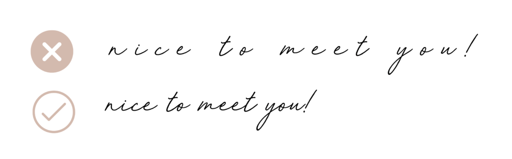
1. Excessive Letter-Spacing
A beautifully crafted cursive script with excessive spacing is a big no-no. Script fonts are meant to flow seamlessly, with letters dancing harmoniously together. The same principle applies to any text on your website, especially paragraphs. When the tracking (the space between characters) is either too expansive or too compressed, words can quickly turn into an illegible mess.
Tip: Strive for a balanced tracking that ensures readability without sacrificing elegance in your script fonts. For other text, maintain a consistent spacing that respects the flow of your content.
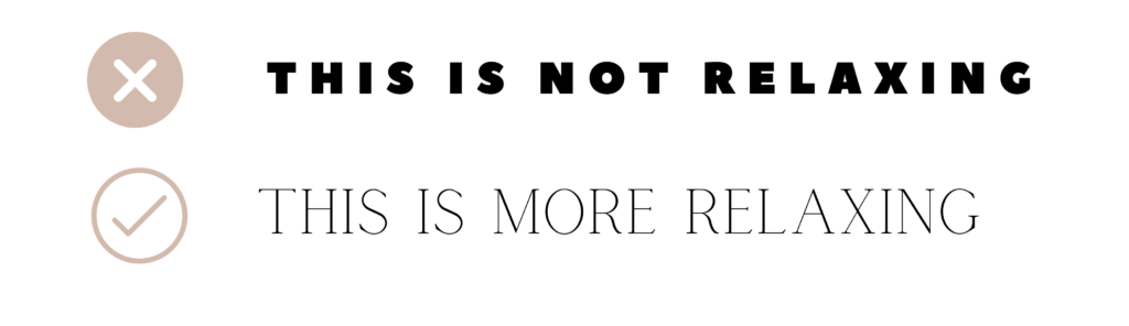
2. Using Inappropriate Fonts
Selecting the right fonts for your business and industry can make or break the ambiance your website conveys. Fonts help set the tone for your brand’s messaging. Consulting with a branding designer (like myself) will help you, as they’ll provide complimentary fonts that will set the tone.
Example: Consider a spa’s website. The use of bold, attention-grabbing fonts may clash with the desired ambiance of relaxation. In this context, opting for a softer, more soothing font aligns better with the brand’s essence.
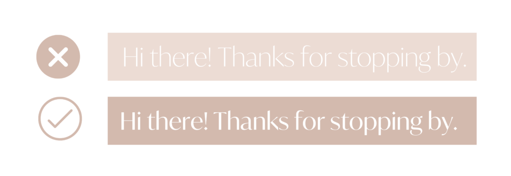
3. Background Contrast Issues
Contrast is the distinction between text color and the background it rests upon. Ensuring text is legible to both the naked eye and those with less than perfect vision is crucial. A useful trick is to squint your eyes to try to read the text. Remember that individuals with poor eyesight may struggle more, so your text should cater to a broader audience. If you find it challenging to read your text due to background color or images, it’s a sign that others will face similar difficulties.
Pro Tip: Collaborate with a brand designer to create a brand guideline that defines the suitable background colors, accents, and text colors to avoid issues of illegibility.
4. Font Overload
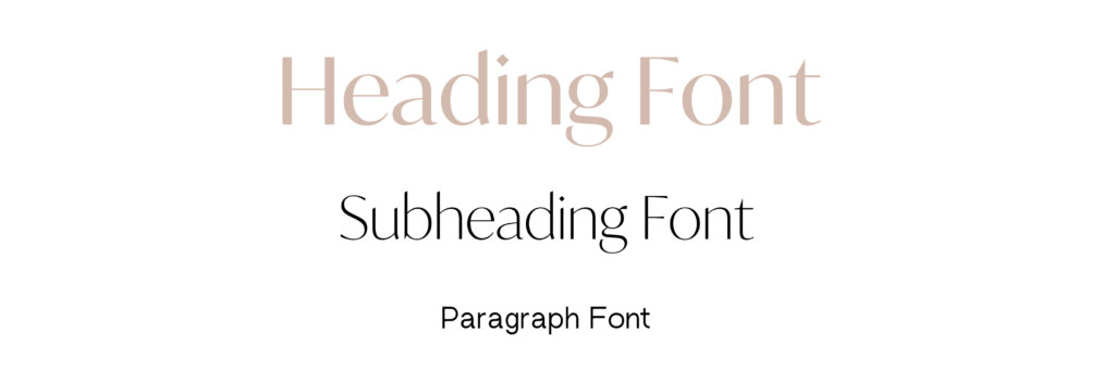
Variety is not always a good thing! I recommend sticking to a palette of three to four fonts at most. Too many fonts can create brand confusion and disrupt the visual cohesion of your site. Consistency is key; maintain uniformity in heading, subheading, and paragraph fonts across all platforms to ensure a seamless, on-brand experience for your audience.
Guideline: Limit your font selection to a handful of options that align with your brand’s identity, and place them consistently throughout your website.
Looking for Custom Website Fonts?
Custom fonts completely changes the way your website looks & feels. Here are my favorite font shops that I use most often!
Blanc Salvage: Get 15% off your first purchase right here with code CREATEWITHDANIELLE
Jen Wagner Co: Explore her unique stunning & popular fonts right here.
Need Help with Your Website Design?
In addition to fonts, your website design may require attention in other areas. That’s precisely why I offer a FREE website audit checklist—a comprehensive 10-page resource designed to help you identify areas that might need refinement or correction on your website.
If you’re wanting to fully re-design your website, my custom website design services or affordable Showit website templates might be the better choice!

Feminine, Clean, Modern
Jessie Showit Template
Compatible With:

Budget-Friendly Showit Templates: Designed to help beginners create stunning websites with confidence. Starting at $275.

Bold, Editorial, Luxurious
Hailey Showit Template
Compatible With:


Inviting, Clean, Calm
Stacey Showit Template
Compatible With:

flodesk Email Templates
Showit Website Templates

Welcome Email Template
Jessie Flodesk Template
Compatible With:

DIY Email Templates: Pre-designed email templates that help you connect with your audience and grow your business.

Welcome Email Template
Hailey Flodesk Template
Compatible With:


Package & Pricing Email Template
Audrina Flodesk Template
Compatible With:

flodesk Email Templates
Showit Website Templates
Shop Our Best-Selling Design Templates


We help create a strategic custom designs that reflects who you really are, helps you reach your biggest business goals, and positions you as the expert you are. From comprehensive brand strategy and logo design to custom Showit websites you can actually update yourself, we handle every detail so you don't have to. Let's create something you'll be proud to call yours.
We take the time to understand your vision (& bring it to life for you)
Certified Showit & Flodesk Design Partner, hundreds of happy clients worldwide, and 3 consecutive "Best Web Designer" awards in our county.

Maybe your website is pretty good, but something feels off and you're wondering if it's time for an overhaul? Our comprehensive website audit checklist helps you evaluate your current site like a pro. Find out exactly what your site needs.
Get Your free audit checklist
Not sure if you need a full redesign or just some tweaks?

