Get access to discounts & resources
Business Tools & Guides
Budget-Friendly Showit Templates
Shop DIY Templates
Your website is where potential clients will come to connect with your business and view the services and products you have to offer. If your website design looks busy or unprofessional, they will exit out before they can learn to trust your company, and you may be losing out on many potential clients.

Many small business owners and entrepreneurs design their website without any help due to the cost. However, you won’t get the sales and leads you to need to grow if your website design is lacking style. This generation is all about aesthetics. They like to see elements “on trend” to grab their attention. If you are not knowledgeable in web design, your site might look unprofessional to your visitors.
Disclaimer: This post includes affiliate links. If you go through them to make a purchase, I will earn a commission. Keep in mind that I only share about companies that I truly believe in and use myself! For my details on affiliate links, please visit my terms of use.
Does Your Website Need an Update?
Hiring a professional for your website design will generate a quick payback on the money you’ve spent on one. You can always get a pre-made website template to start, which are more affordable and built with a designer’s touch to ensure your website is designed strategically. Here are some common mistakes I have seen in websites.
1. No Clear Message
What does your business do for your visitors, and why should they choose you? If this message is not clear the moment they land on your website, it’s already a wrong first impression. Visitors form an opinion on your brand in 0.5 seconds. You should be automatically telling a visitor what you do, and where to go. Missing a call to action is also one of the biggest mistakes I’ve seen on small business websites. A call to action is an invitation for a website visitor to take action right away, whether it’s a button that says buy now, contact me or view my services. What’s your primary goal for the site? What do you want most from it? Quote requests, sales, bigger email list, etc? Promote the heck out of it. Let the visitors know where you want them to go.
2. Not Compressing Images
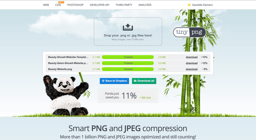
Image compression is the biggest reason for slow websites, and no one seems to know the importance of compressing your image files. It will help tremendously with your site’s load time and help improve your SEO. If your page takes too long to load, your visitors will most likely get frustrated and leave. I have had many people (especially businesses in the wedding industry) tell me that their blog posts are loading slow and are unsure how to fix this. If your blog post consists of many good quality images and you haven’t compressed any of them, here’s your solution!
Your goal is to compress your images to the smallest file size possible while still having an acceptable image quality. Also, keep in mind choosing the right image format. PNG is of higher quality, but a large file size. JPEG reduces quality, but you can adjust it and find the right balance.
My favourite website to use for compression images is TinyPNG! If you’re blogging with Showit on WordPress, there is a plugin called WP Smush, which helps reduce your image file sizes in bulk or manually for your blog posts.

3. Cheesy/Repetitive Stock Photos
Stock photos can be a great addition to your website if chosen correctly. However, some stock photography can be repetitive and cheesy as everyone uses those same images. If the photos you use on your website look fake or overused, it takes away your website’s originality. I always suggest using original pictures and getting a professional photoshoot done. If this is not in your budget when starting your business, I suggest scrolling through Unsplash, Kaboom Pics or Pexels for free stock photography.
Need nice unique photos for your website? Rather than using overused free stock photos that everyone else uses—stock memberships offer better variety! They are usually affordable for a quarterly membership. Here are a few of my favorites:
- Élevae Visuals
- Editorial Stock Images: Use code CREATEWITHDANIELLE for 15% off
- Styled Stock Society
- Moyo Studio: What I use for my design mockups and perfect if selling digital products. Use code CREATEWITHDANIELLE for 15% off
I try to find images I’ve never seen before. If I have seen a specific picture a lot, I will not use it for myself or my client’s websites. A great example is a girl below, which I have seen EVERYWHERE. I’ve seen this photo on websites, social media and advertisements.
It’s a nice picture! But once an image becomes overused, it can take away your brand’s meaning if you’re using the same images as 100+ other businesses. Having original photos will make your website truly one-of-a-kind!

4. No Fav Icon
We often use tabs when browsing for services or products. When you’re searching up a particular service or product, you most likely click on a bunch of Google links and close the ones that don’t fascinate you. Some leave tabs open to eventually go back to the website. Favicons are the visual elements that will help visitors find what they’re looking for and return to your website tab. A favicon is a small image found in the address bar of browsers, search engines and bookmarks. This image represents your website and is essential to have!
5. Poor Typography
When designing websites, I will never use more than three fonts. Using 2-3 fonts is typically ideal while also making sure they pair well together. If your fonts conflict with each other, this will cause a distraction and take away the attention from your website’s message.
It’s also crucial to ensure the fonts are easy to read. I would avoid using script fonts too much, especially for important titles. I like to use sans-serif fonts for the paragraphs are they are easier to read and only using script fonts for something short and sweet.
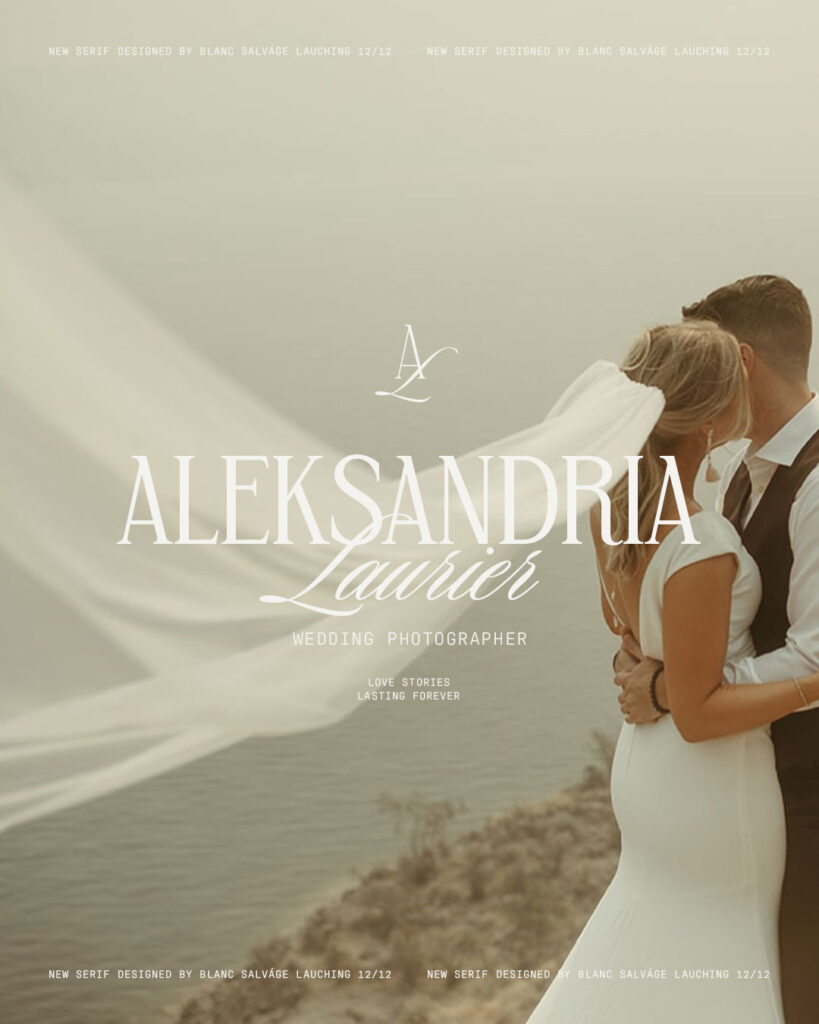
Looking for great unique custom fonts? Custom fonts completely changes the way your website looks & feels. Here are my favorite font shops that I use most often!

Blanc Salvage: Get 15% off your first purchase right here with code CREATEWITHDANIELLE

Jen Wagner Co: Explore her unique stunning & popular fonts right here.
6. Boring 404 Pages
If you decide to delete a page from your website, the link can still be active on search engines or somewhere else on your website. If someone comes across your website by a dead link, they often will leave your site and not bother to check your other pages.
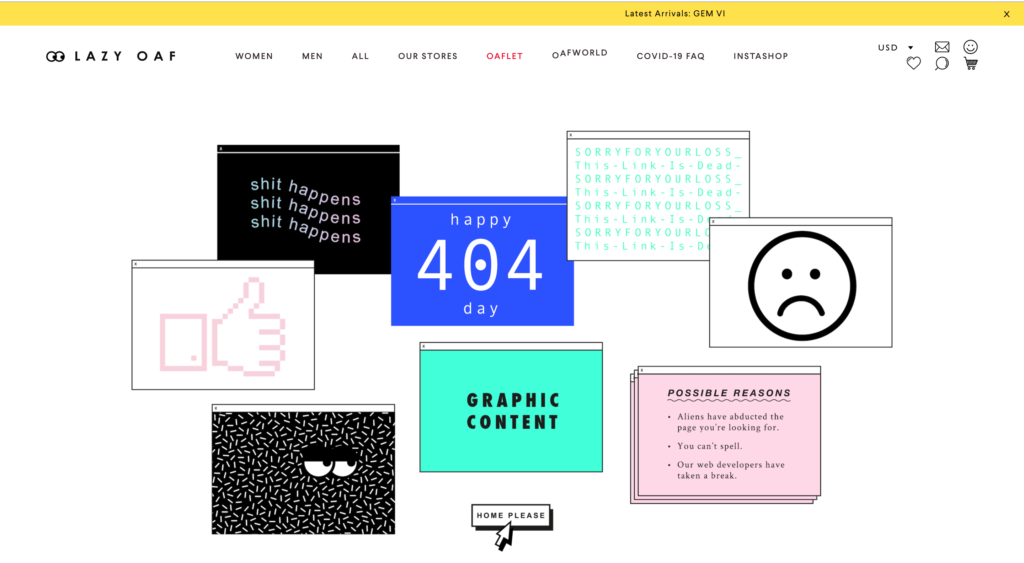
Avoid having a 404 page where it just says the typical “Not Found” message. You can make something unique out of your 404 pages and place a call to action button to redirect them to your homepage! It will grab their attention more than the generic message, and you won’t risk losing a customer due to this silent traffic killer.
Taking Lazy Oaf‘s 404 page as an example. If I come across this first, I’ll most likely want to view their other pages as they grabbed my attention even with a broken link.

7. Pay Attention to Small Details
It might seem like no big deal that your text is a bit off-centred or alignment of elements is uneven on your page. However, this can affect your website’s professionalism.
When I go on websites with content that is not centred, it makes me think they don’t take their business seriously enough to perfect these small changes. Take some extra time to make sure everything is lined up correctly, as every little detail matters! Especially for perfectionists who land on your website (aka me!)
8. Poor Use of Whitespace
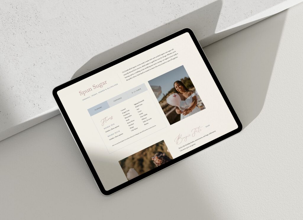
Some people throw everything they want together on one page, without realizing that space is essential to have on a website. It can create a poor experience for your visitors if your website is too cluttered! Simple is always better. Check your website & remove anything that doesn’t improve the visitor’s experience. If you include too many distractions, your visitor will not see what’s most important. If needed, add that content to a new page to limit the clutter.
Leave spaces blank. White space can enhance the main subject and make images/copy easier to take in. The more white areas around something, the more attention it will receive. Don’t think that you need to add graphics or images to fill in all the empty spots; it’s a good thing to have. It can improve readability and increases attention.

9. No Privacy Policy or Legal Documents
When you’re starting a new business, a Privacy Policy is the last thing business owners think about, which is why they end up forgotten and often overlooked. If your website doesn’t include a privacy policy, you could be breaking federal law. It is probably one of the most crucial elements for your online business. Did you know that 50 percent of Americans don’t know what a privacy policy is?
By not following these regulations, there are hefty fines. Laws around the world require you to have a Privacy Policy that it’s hard to keep up. Any tool that collects information from your website (analytics, contact forms, chat widgets, newsletters, etc.) uses visitor data. You MUST disclose this on your website.
You can get a privacy policy custom drafted by a lawyer or use a premade template. The Contract Shop is my favourite! This shop is what I use myself & recommend to all of my clients for their terms and policies. This shop is excellent to make sure you’re protected when you’re starting, without breaking the bank. It’s the perfect solution for small business owners with a smaller budget. Visit their website here to get a privacy policy and terms of use bundle.
Disclaimer: The information provided on this page is for general informational purposes only and does not constitute legal advice. We strongly recommend consulting with an attorney for any questions regarding your specific legal needs. Create with Danielle is not liable for any losses or damages related to actions or failure to act related to the content on this website. I always recommend looking at their website and information to see if it’s right for your business type before making your purchase.
10. Letting Visitors Leave Voluntarily
Having hyperlinks is always essential to have on your website, but it can be damaging if it causes your visitors to leave your page. You’re replacing your site with someone else’s if that link opens in the same tab. Always set links to “open in a new tab” on your website and blog posts if the link given is redirecting visitors out of your website, including your social media accounts and payment processor websites.
Wrapping Up
I don’t expect small business owners to know every little thing about website design. That’s why it can be beneficial to hire a designer who will know how to create a great user experience for your visitors and help improve your online presence. Need help? I offer custom design and premade templates if you’re interested in taking your website to the next level. Let’s get creative!
Disclaimer: This post includes affiliate links. If you go through them to make a purchase, I will earn a commission. Keep in mind that I only share about companies that I truly believe in and use myself! For my details on affiliate links, please visit my terms of use.
Feminine, Clean, Modern
Jessie Showit Template
Compatible With:
Budget-Friendly Showit Templates: Designed to help beginners create stunning websites with confidence. Starting at $275.
Bold, Editorial, Luxurious
Hailey Showit Template
Compatible With:
Inviting, Clean, Calm
Stacey Showit Template
Compatible With:
flodesk Email Templates
Showit Website Templates
Welcome Email Template
Jessie Flodesk Template
Compatible With:
DIY Email Templates: Pre-designed email templates that help you connect with your audience and grow your business.
Welcome Email Template
Hailey Flodesk Template
Compatible With:
Package & Pricing Email Template
Audrina Flodesk Template
Compatible With:
flodesk Email Templates
Showit Website Templates
Shop Our Best-Selling Design Templates
We help create a strategic custom designs that reflects who you really are, helps you reach your biggest business goals, and positions you as the expert you are. From comprehensive brand strategy and logo design to custom Showit websites you can actually update yourself, we handle every detail so you don't have to. Let's create something you'll be proud to call yours.
We take the time to understand your vision (& bring it to life for you)
Certified Showit & Flodesk Design Partner, hundreds of happy clients worldwide, and 3 consecutive "Best Web Designer" awards in our county.
Maybe your website is pretty good, but something feels off and you're wondering if it's time for an overhaul? Our comprehensive website audit checklist helps you evaluate your current site like a pro. Find out exactly what your site needs.
Get Your free audit checklist
Not sure if you need a full redesign or just some tweaks?
Become An Affiliate
Apply HereThe Shop
Hire Us
Resources
Support
© Create with Danielle 2026 | terms & conditions | Privacy policy
+ start earning!